|
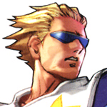
chojuro
|
|
| ogy95 | Date: Tuesday, 2012-01-10, 2:26 AM | Message # 1 |
 Rookie
Group: Generation Starters
Messages: 32
Status: Offline
| some chojuro sprites by me
give credit if used
coment please 

Message edited by ogy95 - Tuesday, 2012-01-10, 2:27 AM |
| |
|
|
| Pinwheel | Date: Tuesday, 2012-01-10, 2:36 AM | Message # 2 |
 Newbie
Group: Generation Starters
Messages: 17
Status: Offline
| Incredibly stiff, doesn't look even remotely like him, his head has a bad shape to it, inconsistent with the size of his body. Oh, and to top it all off, you didn't mention what you edited, nor did you give credits to the person who ripped said sprites.
|
| |
|
|
| ogy95 | Date: Tuesday, 2012-01-10, 2:40 AM | Message # 3 |
 Rookie
Group: Generation Starters
Messages: 32
Status: Offline
| sprites are not edited
|
| |
|
|
| Ace | Date: Tuesday, 2012-01-10, 6:00 AM | Message # 4 |
 Master
Group: Generation Scholars
Messages: 553
Status: Offline
| Well, Pin is right that they're stiff. With that base sprite, avoid using those straight, vertical lines, it makes it look unnatural. Also, the head is in an awkward position on the running frames, I'd advice moving it up a bit. Besides that, I'd say just work on the shading. I can see very little of it on the base, and it seems inconsistent between the walk and run (In the walk the shadow is on his back, but in the run it appears that the light source is to the left) Good effort, but it needs some more work put in. 

|
| |
|
|
| SimTheDog | Date: Tuesday, 2012-01-10, 1:24 PM | Message # 5 |
|
Advanced Member
Group: Generation Masters
Messages: 420
Status: Offline
| His head is too big, all of the shading is too light, you've used outlines in unnecessary areas, you don't know how to shade, and your style is very inconsistent.

http://simthedog.deviantart.com/
|
| |
|
|